Author: Carrera Ortiz

  • Mechanical Keyboards and the Psychology of ASMR

    What are your hobbies? Do you participate in a sport, or do yoga, or grab a paintbrush and make some art? How about something that literally sounds amazing – mechanical keyboards, anyone?
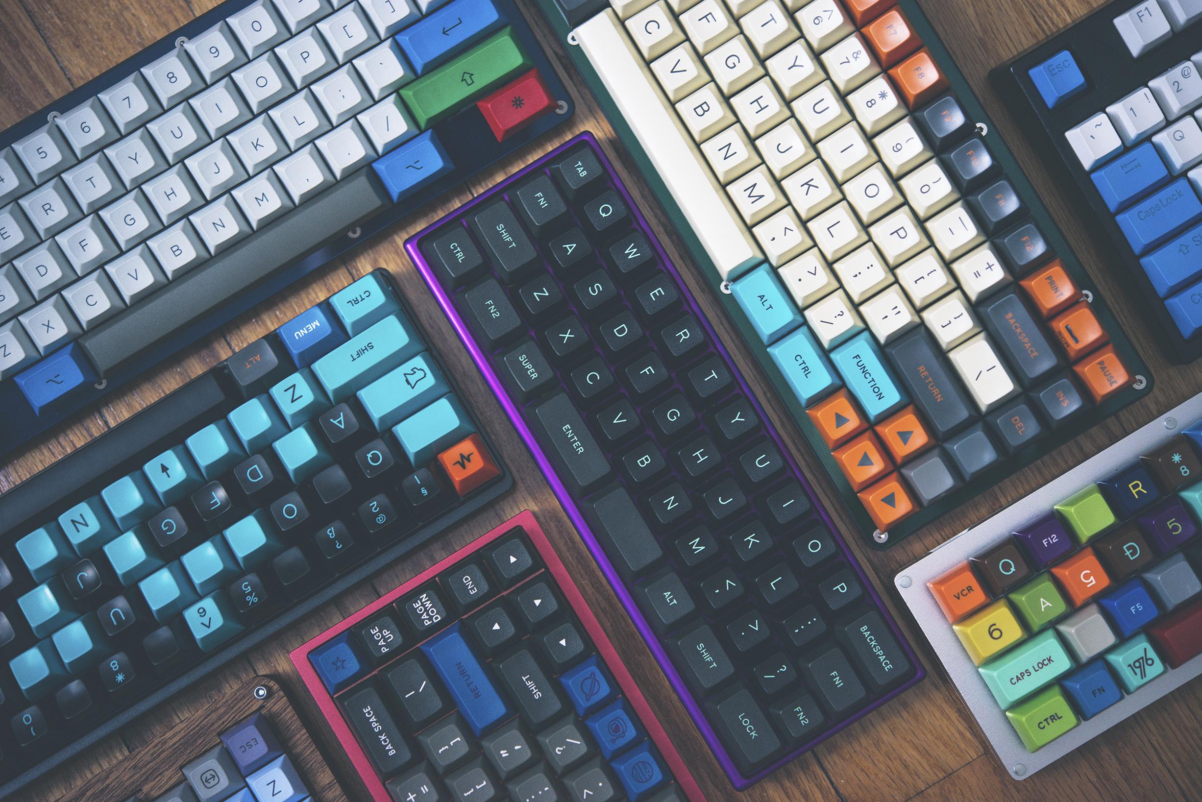
    An image showing muliple mechanical keyboards in different sizes, colors, etc.

    You’ll have to trust me, psychology will be incorporated soon, but first – for those unaware of the magic of mechanical keyboards – let me explain my newest hobby, pictured above,  adapted from one of my presentations. Throughout the slides, you’ll see slides I used for the presentation to allow you to experience it as well!

    To start, you are likely using what is known as a “membrane” keyboard. A membrane keyboard, such as those on laptops or the keyboards you’ll see waiting at the computers in a library, use linked pressure pads that result in the key press to allow you to type. A mechanical keyboard utilizes switches, which are connected to a printed circuit board (PCB) that allow the key press to be registered and result in the typed character. There are thousands of switches, each that provide unique sensory responses, sound characterizations, and aesthetic options. Soon, we’ll delve into the intricate engineering of this important aspect of the mechanical keyboard.
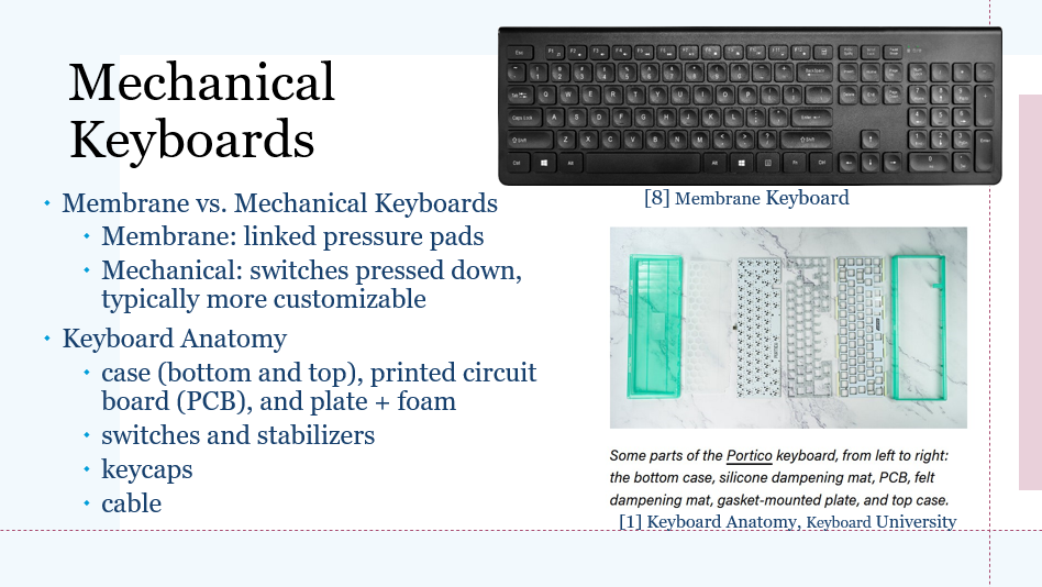
    Focusing on the mechanical keyboard, though there are many modifications and options to add, there are a few basics to create the mechanical keyboard. The keyboard encases a printed circuit board, a plate to mount the switches upon, and typically some foam to help dampen the sounds of the keyboard. With these layers, the switches and stabilizers (used for longer keys, such as the space-bar and shift keys) connect to the PCB, and then are topped with key caps. The top case is put on, plug in the cable, and if all goes well, you have a working mechanical keyboard!

    Given how defining the switches are, it is important to discuss their general anatomy as well. The keyboard switches are made of 6 main parts, with small changes that can be made to create a customizable experience.
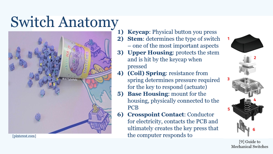
    Most commonly, you’ll see switches in three main categories: linear, tactile, and clicky. The differences between these three are mostly noise levels and the smoothness of the switch. The stem of the switch largely affects this as the switches stem can be made to a certain actuation and travel distance, affecting how much force is needed to complete a key press and how quickly the key press can happen. This not only affects the feeling of smoothness or lack thereof, but is often an important aspect for those in eSports or the gaming community due to the need for lightning fast responses. For this group, linear switches tend to be the most ideal to use.

    So, why do people want to make or buy these mechanical keyboards? The customization may be nice, but this can be quite the expensive hobby. According to Switch and Click, a popular website and YouTube channel centered on mechanical keyboards), “the average cost comes out to be around $200 – 600 per board,” [5]. And yet, despite how expensive this can be and how silly it may sound to have multiple keyboards, it is quite common for people in this hobby to build multiple anyway. With this in mind, I generally split the reasoning of why into two main categories: subjective and technical.
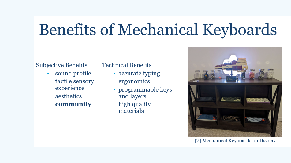
    Slide on the Benefits of Mechanical Keyboards

    The community aspect in the mechanical keyboard sphere is unbelievable. With the amount of trial and error that may come with building a personalized keyboard, there are plenty of people that want to help others and share what they have created. In fact, even here at Georgia Tech we have a student-run Mechanical Keyboard Club for people to share their builds and enjoy the hobby together! I have no doubt that the expensive aspect actually brings about more community, as people search for such a wide variety of builds to get an idea of what they enjoy the most in terms of sound and looks before shelling out some Benjamins for their ideal keyboard. The previously mentioned Switch and Click YouTube, as of late April 2023, supports 701K subscribers, which has increased about 15K subscribers since I last checked almost two months ago. The community is huge, and only continues to grow as it reaches more people.
    So, how do people typically first find the mechanical keyboard community? The ‘First Contact’ is not necessarily through someone you know showing off their keyboard. In fact, I think one of the most common ways to venture into the hobby is first by seeing Keyboard ASMR. For those that enjoy or who have never heard of it, I encourage you to watch at least a minute of this 1 hour ASMR video from “The Way ASMR” channel – who may be referred to as an ‘ASMRtist’.

    https://youtu.be/xAVoQx2hUpk

    Now, as I have promised, we delve into the realm of psychology.

    What is ASMR? ASMR stands for Autonomous Sensory Meridian Response. According to Psychology Today, ASMR is “[the] name given to a tingling sensation, typically on the scalp, neck, or back, that some people report feeling in response to certain visual or auditory stimuli,” [3].

    For the reader, I have a question. Have you experienced ASMR? I encourage you to submit your answer in the poll below, and see what others have said!

    https://strawpoll.com/polls/eNg69l8EAnA

    ASMR is a relatively new psychological phenomena, with few peer-reviewed articles on the subject, and even fewer that employ empirical data to analyze. Not to worry, I have dug through all the academic tunnels to find a few for this article. From a psychological perspective, many psychologists and researchers may be curious to answer questions on ASMR, such as: ‘is this a common experience?’, ‘how do we define ASMR?’, ‘who is helped by ASMR content the most?’.

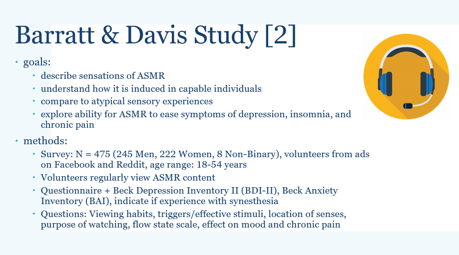
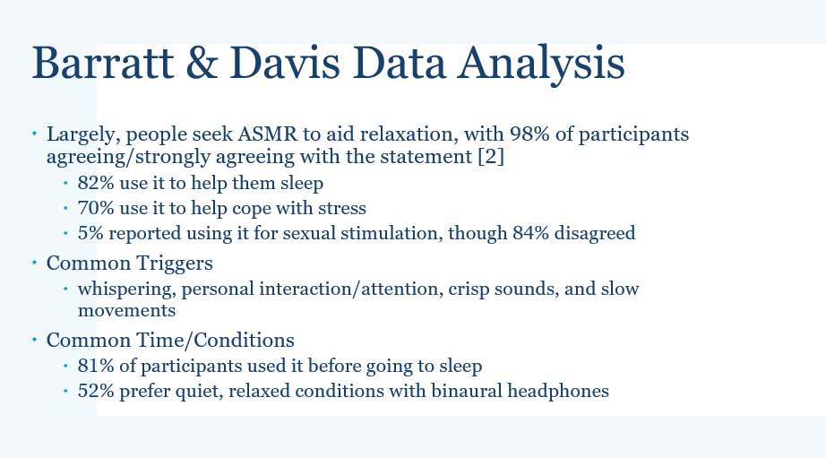
    In one article, from authors Dr. Barratt and Dr. Davis, I have outlined their goals and methods on their research of the ASMR experience.

    IMPORTANT NOTE: This study discusses ASMR, occasionally in the context of mental health issues such as depression, and chronic illness. The analysis or results of this study is not meant to provide any diagnosis, cure, or medical advice, and is only meant to identify any patterns or gather data on perceived helpfulness from study participants. If you or anyone else you know is struggling with chronic pain or mental health issues, please reach out to licensed professionals for help in coping and health management.

    The methods employed in this study aim to yield a mix of both qualitative and quantitative results. Additionally, the study wanted to draw comparisons with other sensory disorders and states such as synesthesia and a ‘flow’ state – which you may have experienced while studying. Small spoiler alert, there wasn’t a strong connection of ASMR with either synesthesia experiences nor the flow state, indicating that ASMR is its own psycho-neurological experience.
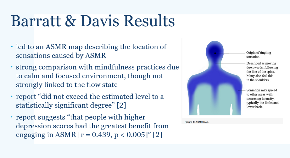
    Ultimately, ASMR is something comforting and relaxing to watch and listen to for those that experience the sensations associated with ASMR. People enjoying the customization of their keyboard may find satisfaction in their work and the ability to almost create their own ASMR by utilizing the keyboard they have made. Though we understand that ASMR can be as a temporary way to boost mood and relaxation, especially those experiencing depression, more research is needed to fully understand how ASMR works in individuals. Without a significant connection to other known sensory disorders, other than effects of mindfulness, the neural underpinnings of ASMR and the extent of the selection of people that can experience ASMR are still a mystery.


    Citations:

    [1] Keyboard University, url:  https://www.keyboard.university/100-courses/intro-to-mechanical-keyboards-p6brj

    [2] Barratt EL, Davis NJ. 2015. Autonomous Sensory Meridian Response (ASMR): a flow-like mental state. PeerJ3:e851. https://doi.org/10.7717/peerj.851

    [3] Psychology Today, url: https://www.psychologytoday.com/us/basics/asmr

    [4] Stephen D. Smith, Beverly Katherine Fredbord & Jennifer Kornelsen (2017). An examination of the default mode network in individuals with autonomous sensory meridian response (ASMR), Social Neuroscience, 12:4, 361-365, DOI: 10.1080/17470919.2016.1188851

    [5] Switch and Click. Article. Url: https://switchandclick.com/what-is-the-average-cost-for-a-custom-mechanical-keyboard/

    [6] The Way ASMR. “Cozy ASMR Typing for 1 HOUR / No Talking / Mechanical Keyboard Sounds / Gateron Red Switches”. Online Video (YouTube). Url: https://www.youtube.com/watch?v=xAVoQx2hUpk

    [7] kane#6661. Image from Discord. ‘mechanical keyboard display station example’.

    [8] Image of Membrane Keyboard. Url: https://www.bestbuy.com/site/best-buy-essentials-be-pkrfkb-full-size-wireless-membrane-switch-keyboard-black/6460659.p?skuId=6460659

    [9] Ultimate Guide to Mechanical Keyboard Switches for 2020, Dygma, url: https://dygma.com/blogs/stories/the-ultimate-guide-to-mechanical-keyboard-switches-for-2020


     

  • Evolution of My Design for The Devil Wears Science

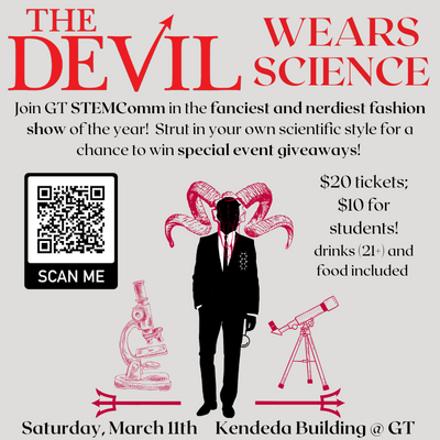
    Howdy! In planning for our event, The Devil Wears Science, in the Atlanta Science Festival, I took some initiative in a few spaces. I have helped to look into the best areas, in and around campus to host our event (and what fits a small budget), with the ultimate answer landing to an on-campus event at our Living Science Building of Kendeda! I’ve also looked into potential partners, and felt impressed with Dr. Jayaraman, a professor here at Georgia Tech in our Material Science/Engineering department and brought him on board. He has been incredible, and invited an impressive colleague, Dr. Sungmee Park to join the effort. Yet, one creative aspect I’ve worked on for this event was very creatively fun and encouraged me to do some thinking on marketing/interactions between our audience! For this, I have been working on some interesting designs and flyers! Starting in fall, I made a general logo that I thought would be fun to put on basically everything. It could be used for flyers, social media, buttons, and more — maybe even given out on some items to commemorate the event! Here, I wanted to discuss the evolution of my design work! Though it’s a small turn from the usual science content, I hope you enjoy.

    Logo for ASF Event The Devil Wears Science made by Carrera Ortiz

    The picture above shows the general design I made during fall of 2022 – a centerpiece for future event illustrations. First, I wanted to focus on the general color palette that matches the theme. Wanting to stick to the hellish theme, I initially knew black and reds would be crucial, but it took some time to figure it all out. In trying to find how best to represent the devil here, I came to the conclusion that a men’s silhouette would be best, and finding a suave man in a suit was very fitting. Because of this, even though black is dark and brooding, it would not work for the background as it would remove some of the suit details. Instead, I chose a grey to be the background color as its one of my favorite colors and goes well with black and dark reds. Initially, I was actually working with some red dresses and devillish faces, but I enjoyed the pivot of the formal ‘Man In The Suit’ better. Moreover, I found a cool satanic-looking goat head pattern and wanted to include this in the design. Overlaying this on the head leaned into ‘The Devil Within’ vibe that sparked a lot of intrigue. With that solidified, I went on to include more science aspects into the design. I think my favorite inclusions are the subtle aspects such as having the devilish man have a chemical structure handkerchief and holding a small magnifying glass. I feel like it shows that he is interested in science, and is also slightly ‘wearing’ it as well! At the event, I enjoyed that one of the STEMComm faculty members and professor here in the Chemistry Department at Georgia Tech, Dr. Evans, came to the show with some chemical structures clipped onto his blazer! It’s a fun little parallel to this, and even though I don’t think he intended to be similar to the devil man here, it was hard not to think of it!

    Onto the background details, I wanted to balance the image with more elements of science on the sides. When I found these detailed images of a microscope and telescope, I knew I wanted to include them somehow. They matched well with the sudden increase in artistic complexity of the goat skull, and added some focus on the STEM interests of the club. In order to tie it in to the design, I used these tridents for the instruments to ‘rest’ on, rather than as a devil tail or something similar. From a physics perspective, I liked the symmetry and the tridents hold a resemblance to the psi symbol (ψ) as it usually represents wave functions used in modern physics and quantum mechanics. The symmetry also reminds me of bra-ket notation also used in these fields, especially when wave functions are involved. Though most people likely won’t think of that, it was something that made me happy. With many scientific representations on and around the Devil, I felt like I was really satisfied with the general design, and it was extremely fulfilling to see it being shared on social media and on the program that was handed out to everyone at the show.


    With the general design finalized, it was time to apply this to marketing the event. Since I created the design, I took initiative to also create the flyers for the event, which took many iterations to perfect.


    First Flyer Edit for The Devil Wears Science made by Carrera Ortiz

    After reviewing many other flyers I wanted to keep it simple and ensure it included the basic details: event name, short description, location, date, price of tickets + how to buy them, and of course, the design. For the event name, I wanted it to look extremely similar to the flyers for “The Devil Wears Prada” since we’re doing a word play on that, so I found a similar font called RoxboroughCF on Canva. I also created a QR code so that people could easily access the ticketing website, and emphasized the date and location so that people could easily schedule to come to the event! I wanted to have a relatively balanced look, offsetting the teaser + info and ticketing information on either side.


    Second Evolution of the flyer for The Devil Wears Science event, made by Carrera Ortiz

    Here, I felt like the information didn’t say everything we wanted to say, so the main change I made was taking the information from the ticketing website and copying it onto the flyer. I also offset the ticketing information to balance around the character. Due to the large amount of text, I minimized the size of the devil design, which made some details a little difficult to see. I also really liked having the location and time bolded on the bottom, mirror the symmetry of the tridents on the bottom. I felt like it is still in focus enough that it can’t be forgotten, but not so awkwardly on the flyer. Plus, it allowed for more information about the event.


    Third Evolution of the flyer for The Devil Wears Science event, made by Carrera Ortiz

    From here, I wanted to cut down on the large wall of text and emphasize the design, but it didn’t feel quite right yet. At the least, there’s more room to show the design!


    Fourth Evolution of the flyer for The Devil Wears Science event, made by Carrera Ortiz

    I realized that the ‘text logo’ (vs. the design which I will now refer to as the logo) was too attached to the top and needed margins to look better. I think this is one of the best improvements I had made. Additionally, to help justify the price to others upon first seeing the flyer, I mentioned that we will be serving alcohol and food. The next iteration is the same except I took out ‘for all’ because it seemed redundant and not entirely true due to the legal aspects of alcohol, even if I did declare that it is for those aged 21 and over.

    Fifth Evolution of the Flyer for The Devil Wears Science event, made by Carrera Ortiz

    The update is shown above, with considerations in mind! Yet, it still felt word-y, and some of my peers and designer friends agreed. Thus, the final result comes along:

    Sixth and Final Evolution of the Flyer for The Devil Wears Science event, made by Carrera Ortiz

    So, I really cut down and emphasized the most important aspects of the event information. Additionally, we wanted to convert the ‘voting’ to focus less on the presentations and instead on audience engagement and hopefully see a lot of fun science themed outfits (which we did)! This way, there was no inequality between presenters that we were extremely grateful to for their help with the event.

    With more balance between design and text, this became the final edit with important information bolded for easier reading. Throughout the process, I looked for input from other members of STEMComm as well as from a few friends/co-workers that work on making social media graphics, and we all found consensus on this edit.

    Then, for marketing purposes, we realized the importance of having a version of this flyer for social media. We knew that it would be redundant to have the QR code (those holding their phone aren’t going to need to scan with the phone their holding), but we can include links instead! For now, I have two versions that are almost identical, where one includes a tinyurl link just in case social media links get a little busy. We planned to include a linktree in the bios to access where the QR code went to, but I know sometimes on instagram, you have to go through different unnecessary steps that make people less likely to go to the link. Given that this is for social media, I also looked into the ideal aspect ratio/pixel widths so that it looks best on instagram stories or other postings.

    Here is first social media flyer iteration:

    First iteration of the social media version of The Devil Wears Science event, made by Carrera Ortiz

    Then, its evolution:

    Second Evolution of the social media version of the flyer for The Devil Wears Science event, made by Carrera Ortiz

    So, which one is your favorite? Do you think the final versions are the best, or is something not quite right to you? Hopefully, you’ll have already seen the final versions before and it encouraged you to come to the event.

    With these finalized, the members of STEMComm all went to social media to share these online and post about the event. We also looked into sharing flyers around campus to encourage more people to come.

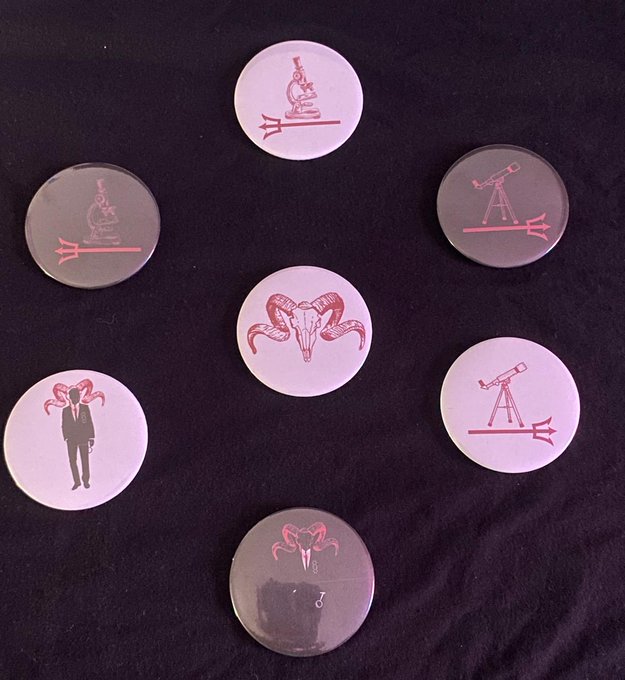
    Afterward, I thought it would be nice to have small giveaways for everyone that attended. Thanks to the Invention Studio on campus (follow them @gtinventionstudio on instagram!), I knew I could make pins/buttons and more. I didn’t want the full design to be a sticker/button because its large, so I thought to emphasize the details. So, I made separate images including just the smaller elements and had two versions with white and black backgrounds for more options. I ended up with 7 main designs that I created into pins, and I think they turned out amazing and I am so glad we were able to give them all away to the attendees! Thanks to Jalen, we were able to make some stickers as well. Additionally, Dr. Leavey gave us acrylic to work with, so Isabelle and I went to the Invention Studio together and she worked with the laser cutter for some cool devil charms. One of the other STEMComm members, Michelle Stanek, was also able to make earrings from the charms as well, which turned out amazing!

    Image showing the 7 completed pin designs made by Carrera Ortiz at the Invention Studio.

    And this was the evolution of the design created for The Devil Wears Science event. I was extremely grateful to use some creative abilities to help the show, along with my conversations with the MSE department leading to the presentations from Dr. Jayaraman and Dr. Park’s contribution. I cannot wait to see what STEMComm ends up doing next year. Thank you to everyone that showed up for this event!

    Stay curious, everyone!

  • The JWST Mission – Part 1

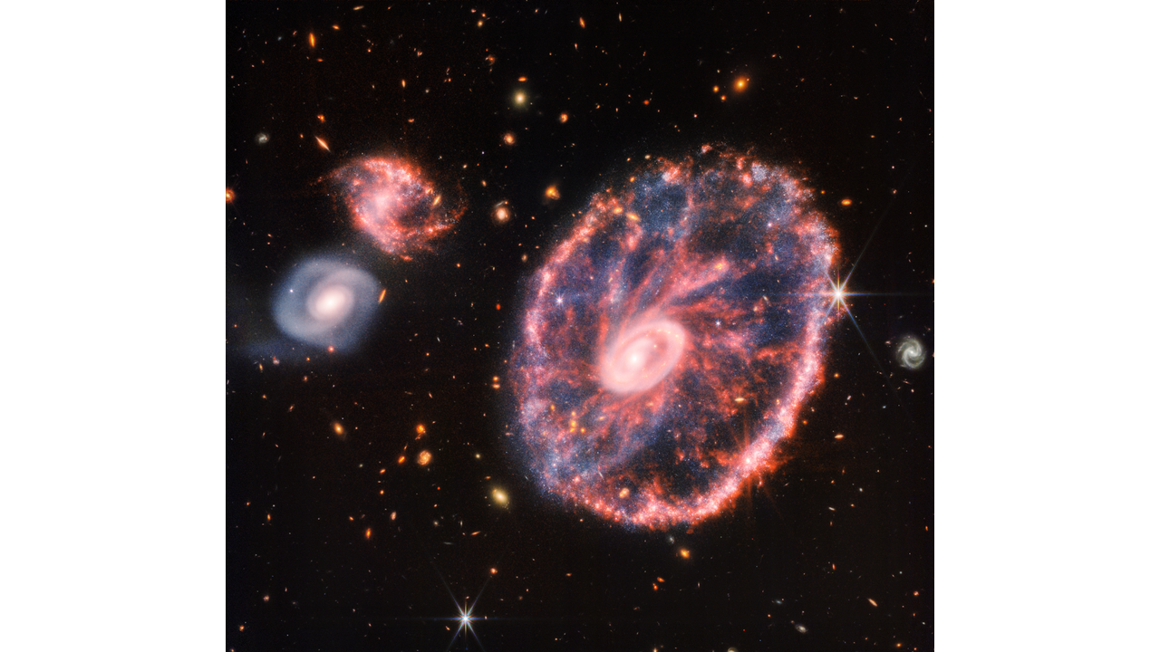
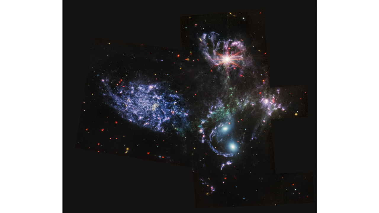
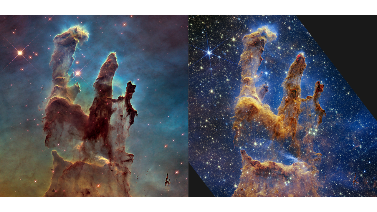
    With the recent launch almost a year ago of the James Webb Space Telescope [JWST], alongside the beautiful pictures released from this grand telescope, you may have seen some exciting hype around the “premier observatory of the next decade” (NASA – JWST). In case you have missed out, here are some of the images from JWST!

    Cartwheel Galaxy (NIRCam and MIRI Composite Image). CREDIT: [2]
    Stephan’s Quintant (MIRI Image). CREDIT: [2]
    Pillars of Creation (Hubble and Webb Images Side by Side). Hubble image on Left, Webb image on right. CREDIT: [2]


    Though it is incredible to be able to view space in such detail, the telescope is more than just an incredibly expensive camera. For astronomers, physicists, and enthusiasts/curious minds alike, I will detail the mission of JWST, how it got its name, and the great feat of engineering that this telescope symbolizes.
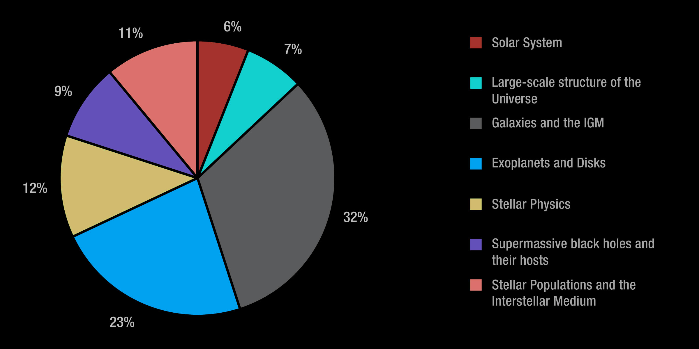
    The James Webb Space Telescope is the result of an international collaboration between many space agencies, namely NASA, ESA (European Space Agency), and the CSA (Canadian Space Agency) [1]. The JWST is expected to last a minimum of 5 years, though there is hope that it can last at least twice that long. Be sure to temper your expectations for that longevity, as this telescope is much further away from us than Hubble, meaning that though we can service Hubble should issues arise, JWST is much too far away to be able to fix it manually. We simply must trust that the engineering that has gone into its creation is enough to protect it from all that may happen to it so that it can last as long as possible. The longer the JWST lasts, the more information on our universe we can collect! Many researchers, at all levels, interested in our universe have slated time with the telescope. In general, the JWST is largely able to explore the early universe, galaxies over time, the lifecycle of stars, and other worlds/exoplanets. In its first cycle, the largest category that JWST will spend its time on is galaxies and the inter-galactic medium (IGM), as shown in this pie chart created by NASA and P. Jefferies (STSCI). But, with all this time and all there is hidden in the universe for us to discover, the possibilities for JWST are essentially limitless.

    Fractions of time allocated in Webb Cycle 1, by science category. CREDIT: NASA and P. Jeffries (STScI).


    Previously, one of the most known telescopes was the Hubble Space Telescope, named after Edwin Hubble – a notable astronomer that elevated the field of astronomy and cosmology with his observations. Another key observatory of our time is the Chandra X-Ray Observatory, named after Subrahmanyan Chandrasekhar, who from my studies here at Tech, was key in our understanding of the lifecycle of stars and how mass plays a role in their evolution. In his study of white dwarfs, he discovered what is known as the Chandrasekhar Limit – an upper limit on the mass of a white dwarf. With such key figures having their names associated with these feats of engineering, the question is: Who is James Webb, and what has he done to have this telescope named after him? Surprising as it may be, James Webb is actually not an astronomer (or physicist or scientist, for that matter). James Webb was a director of NASA, and according to Webbtelscope.org, he is “best known for leading Apollo, the series of exploration programs that landed the first humans on the Moon” [2]. He played a crucial role in getting public and governmental morale for the program, even through tough situations, such as the unfortunate deaths that occurred during the Apollo 1 mission. James Webb is credited for NASA being as huge as it is today, as he laid the groundwork for it to expand into so many missions even past Apollo. Despite this, the naming of the telescope after James Webb was not without its opposition. From history, you may remember that during the era of the Space Race where we sought to “outrun” Russia with our STEM programs, especially that of leaving Earth, there was also a great fear around communism, leading to the “Red Scare”. Less well known, but with similar animosity and paranoia, was the “Lavender Scare”. The Lavender Scare was essentially the paranoid masses wanting to purge any LGBTQ+ individuals from the rest of society due to homophobic thoughts on the morality and deserved (in)equality of certain people. In fact, during Webb’s reign as a director, a budget analyst was fired for indecent conduct, solely based on the assumption of homosexuality. Many argue that even if he did not directly influence this firing, he as Director had enough influence on the agency to encourage the moral obligation of taking a stance against homophobia. Petitions were made hoping to strike Webb’s name off the telescope, with many suggestions for replacement, such as Sally Ride – the first American woman and lesbian in space – among many other suggestions. Though investigations have not shown strong evidence that these claims are true, it is considered by many at best a complicated history with other figures and ideals that could replace the name. Though the name is not changing, I personally prefer calling it the “Jelly Welly Space Telly” as a fun and exciting name that does not relate to possibly homophobic individuals. More formally, I will always refer to it as JWST, as you will see in this article due to my personal stance on the matter.
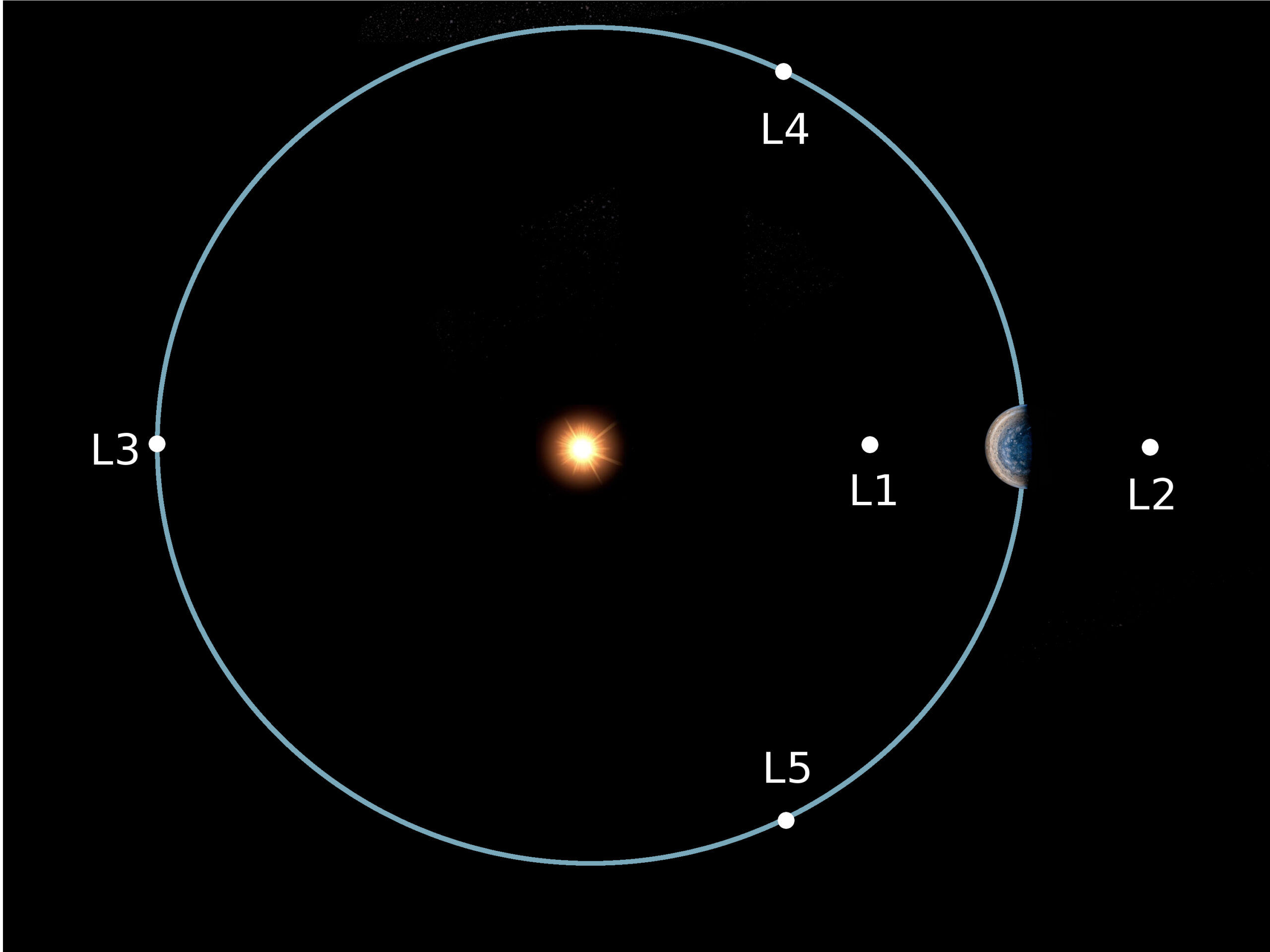
    Moving onward, we have a glimpse of the possibilities of what this telescope can accomplish, or at the least, some amazing images of what it can see in space, but what makes this telescope so much more intense and exciting than others, like our good ole’ Hubble Telescope? Other than being almost 10x as expensive at 10 billion dollars, the JWST is extremely precise in many aspects, and an intense thermodynamical achievement as the instruments require. Along with the distinct gold hexagonal mirrors and its sun-shield base, the cameras/instruments carried by the JWST are the NIRCam (Near-Infrared Camera), NIRSpec (Near-Infrared Spectrograph), NIRISS (Near-Infrared Imager and Slitless Spectrograph) and the MIRI (Mid-Infrared Instrument). You may have noticed that each of these instruments are focused on the infrared. This is a key component that should allow us to see a different perspective and farther into our universe – ideally around 13.5 billion years into the Reionization Epoch, which I will cover more in a future article. For now, it is important to understand that essentially, looking in the infrared region is similar to looking at heat – meaning that the telescope itself must remain incredibly cool to avoid any corruption of its images by surrounding heat. The JWST is an incredible collection of work from the launch vehicle, its image processing units, its electromagnetic systems, cooling systems, and its unmistakable golden mirrors and sunshield. This system – originally folded for storage before it launched into space – will be at a special point in space called L2. L2 is a Lagrange Point 1.5 million kilometers from Earth. For reference, our Hubble telescope is around 570 kilometers from Earth, and our Moon is around 384,000 kilometers from Earth. Though far away, it is a crucial point in space that allows for a long-life for our special telescope. The Lagrange point, which is not a reference to my hometown surprisingly enough, is a point in space where a satellite may remain in orbit relatively stable due to the balance of gravitational energy between 2 objects. With this stable orbit, the JWST is able to conserve fuel usage by using very minimal amounts to remain in one area. This area specified by L2 uses Earth to block the light from the Sun, to help with the cooling required by the telescope. Other points are key for different missions. The L1 point would be incredibly damaging to JWST but is an ideal spot for a telescope that would be used to study our Sun.

    Lagrange Points in Space. CREDIT: [6]


    If it hasn’t been emphasized enough, the JWST must be kept at EXTREMELY cool temperatures. In order to operate correctly, the dark side of the telescope must be at -233॰ C, or -388॰F. Even with the Earth blocking some sunlight, it is expected that the Sun will still dump about 200,000 watts of power onto the sunshield, and the engineers had the tough goal of ensuring that no more than 1 watt would get past. In order for a sunshield like this to work, it has a list of requirements, and ideally is also lightweight for the launch into space to go smoothly. The desirable properties of the sunshield are for it to be strong, resistant to degradation from solar radiation, stable over a large range of temperatures, and reflective [3]. The solution is apparently a high-performing plastic called Kapton, rolled into extremely thin sheets. This material crosses off each requirement except for its reflectivity. Luckily, the material was easily able to be coated in a thin layer of aluminum to add the reflective property to counteract the radiation. Layers of this material were created very specifically, with gaps to utilize the insulating and cold nature of space to help cool down the telescope even more. Additionally, these layers were angled relative to each other such that sunlight is deflected away from the dark side of the telescope and less heat is absorbed by the solar radiation. These layers also need to be protected from tears of possible impacts from micrometeorites. The tension in the layers is quite high, meaning that any rip that occurs could easily expand and ruin the integrity of the telescope, allowing heat to escape to the precious equipment. To prevent this, rip-stop seams were molded into the sunshield. Every possible parameter was thought of by the team of engineers that worked on this amazing telescope. Yet, the difficulty here isn’t over. In order to be stored in the rocket that would launch the telescope into space, many parts of the telescope were folded and meant to unfold in space. For a 10 billion dollar telescope, it is quite the gamble to risk it unfolding incorrectly, ruining the engineering put into place over 25 years. In just unfolding the sunshield, there are “over 300 single points of failure in this unfolding sequence,” [3]. Luckily enough, I can spoil it for you that indeed no failures occurred, but is an intense situation nonetheless.
    Yet, the coolest part of the telescope is yet to come, and I mean that literally. From before, I mentioned that one of the instruments was named MIRI. This instrument is extremely sensitive, requiring an intense cryocooler to keep it at a mere 7॰K. This insanely cool temperature is achieved by intense physics. The cryocooler needs minimal to no vibrations and some electricity. To minimize vibrations, many pulleys and balanced weights are included so that every movement is precise and calculated. With electricity comes heat, and thus a need to separate some cool and warm air. Using basic principles of acoustics, the cryocooler involves a complex system. This complex system can be conceptually simplified using thermoacoustics, which utilizes the pressure and temperature relations in air and a standing wave to create a piston inside of horizontal cylinders. These cylinders contain a stack, which separates the cool and warm air, which allows attachments to expel the warm air into the sunshield which can dissipate the heat. This system is quite the expensive unit itself, and just an incredible physical process. It is shocking to me that we are capable of creating a system that can reliably keep something just a few degrees above absolute zero temperature.
    Now, for one of the most distinct parts of the telescope. The golden mirror, composed of 18 hexagonal segments, at 6.5 meters in diameter. The hexagonal shape was chosen because it is “roughly circular, segmented mirror” with few gaps and six-fold symmetry [8]. Essentially, due to the necessary folding requirement, NASA needed a shape that could eventually be roughly circular so the image wouldn’t distort in any one direction, and that was symmetrical so that precise optical calculations could be made easier, thus the interesting shapes. The materials chosen for this were also quite different than that of Hubble, and much lighter to make its launch easier for such a far distance. The mirror surface is made of Beryllium, a material that is much easier to break than steel, but much harder to deform at a young’s modulus of 300 Gpa. Though it is not a reflective material, requiring a coating of gold that is 0.1 micron thick. Learning from past mistakes, the JWST mirror is programmable to avoid unserviceable optics issues. In the past, Hubble had major optics issues that were only able to be fixed due to its close nature. JWST does not have this advantage, so the ability to adjust on a scale of wavelengths of light to keep the primary and secondary mirror aligned is crucial to the mission being operable at all. The mirrors also have a Cassegrain focus hidden in the center, using a fine guiding system that almost constantly adjusts to remain focused on a guiding star that is always in its center of field of view. This image stabilization tool is incredibly precise, and is another key aspect of the amazing engineering that goes on in this telescope.
    This new observatory has touched so many people and will inevitably lead to so many discoveries about our universe. The level of excitement that I and so many others have for what there is to discover from the data we can now collect is at such an all time high, there was no way I couldn’t write and share this with you. Indeed, this is just the start of what I will be sharing; I couldn’t fit all that excitement into one article! Honestly, I can basically write a textbook solely on this topic because there is so much information hidden in every release and I want it all to astound everyone else as much as it has for me. Here, I discussed how its made and the purpose of this new telescope, and soon I can’t wait to discuss in depth what this technology is actually bringing to the science table.


    References:

    [1] James Webb Space Telescope | NASA

    [2] Webb Home (webbtelescope.org)
    [3] The Insane Engineering of James Webb Telescope – YouTube
    [4] The James Webb Space Telescope’s Cloud of Controversy – Viterbi Conversations in Ethics (usc.edu)
    [5] NASA James Webb Space Telescope stirs controversy over name, LGBTQ discrimination – The Washington Post
    [6] The Lagrange Points – Lucy Mission (swri.edu)

    [7] (featured image) Artwork:Photographs:Webb Mission:James Webb Space Telescope Artist Conception (webbtelescope.org)

    [8] Mirrors Webb/NASA

  • LaTeX: A Typesetting Guide

    As an aspiring scientist, I look to encourage as many people as possible to read what knowledge I can share. Technology has made that incredibly easy, as proven in history by the boon caused by the printing press. A huge proponent of sharing information is the accessibility to a wider audience, and part of that leads to a discussion on aesthetics and formatting. Even now, I’m aware of the way that each indent in this article will help make it easier for you, the reader.  In science, there is so much data and foundations to cover to be able to support all of these knowledgable ideas and to get to that quicker, the LaTeX Project has made it easier to streamline all of this together so that scientists can do what they do best – share their knowledge. Now, I hope at this point you’re aware that the LaTeX project has nothing to do with gloves commonly adorned by doctors, or the red suit that Velma (our new lesbian icon) wore in the Scooby-Doo live-action movie. If not, let me explain. From the site itself, “LaTeX… is a document preparation system for high-quality typesetting… often used for… technical or scientific documents,” (The LaTeX Project.org). During a semester where all but one of my professors strongly encourages submitting all work in LaTeX, and previous reports submitted under the guidelines of the American Physical Society, I felt it part of my duty to share some wisdom on the subject of writing in LaTeX.

    To start, I use the online tool Overleaf to work in LaTeX, but there are other options such as TeX maker to start your LaTeX journey. My personal preference is Overleaf, but TeX maker may be helpful if you often find yourself without internet connection and still needing to edit your .tex files. 

    When creating a new project, I try to keep in mind what my purpose for the document is, and if I need a specific template (either offered through Overleaf or some I have made on my own). Often, I just make a copy of the template I have made for homeworks and continue editing it to the specifications of the class I am using it for. Othertimes, I’ve used some of the resume templates to try my hand at that. Of course, each project is different, so its good to experiment on your own with different possibilities!

    In all projects, there exists the title and metadata, where I can note that I am the author, list co-authors, the date, and more, all contained within the preamble section. The preamble section is where the outline of the formatting is, and a bank for all the tools you may need as you go. One of the most useful parts of the preamble is the selection of packages you include, as it widens your ability in what you’re able to accomplish in the document. For example, if you would like to show images, there’s a package called graphicx to help neatly organize the image onto the document and minimize the struggle of neatly fixing it in place. As a physics major, the packages I might use most often are: amsmath, amsfonts, amssymb, graphicx, physics, sinunitx, mathtools, verbatim, and more. You may find some other helpful packages for your own use! Moreover, the preamble is where it is stated what class the document falls under – such as article, report, book, and so many more options with even more available modifications.

    Then, the document begins. Literally. The first environment, typically indicated with the “\begin{ }” (and “\end{ }”) command,  is introduced immediately after the preamble, as the document is its own environment. Whatever is typed outside of the environment will not directly be reflected onto the pdf version (unless it is formatting stated in the preamble). If I were to re-create this article in LaTeX, the first thing I would do in the document environment would be to use the command “\maketitle” so that it could take the title from the preamble and format it neatly. I could also make a section called the Introduction to let you know what the paper was all about! Sections are helpful to organize the document to make it easier on the reader, and can especially be helpful for lab reports. To create sections, you’d use the “\section{}” command, where you’d put your section title in the argument of the command. For example, let’s make an Introduction:

    And without touching any fonts, bold, or anything like that, we have the start of a LaTeX article!!!

    Before continuing on, allow me to clear up some basic syntax of LaTeX. As we’ve seen with the “\section{}” command, we have arguments (args) that are usually represented with curly braces: {}, and in some cases extra parameters are in straight braces: []. One common example is “\usepackage[utf8]{inputenc}”, where this (as far as I know) is a basic formatting setting. With the section command, we inputted “Introduction” to the argument so that we could name the section. Additionally, like most programming languages, there is a way to put comments in the coding portion of LaTeX that doesn’t show up in the pdf version. This is very helpful to explain new commands you’ve created or directions for a template. The comment is indicated with “%”. Anything typed after this on a line will not show up until you go onto a new line. If you would like to manually create a vertical spacing delimiter (in other words, a new line), you can use “\\”. This is not indented for the next paragraphs you may start. For horizontal spacing delimiters (simlar to the tab key) you can use “&”, which you will most commonly see in creating tables. These are the most likely syntax related things you will come across (other than the escape key)!

    As helpful and streamlined as this all is, many people may still prefer to use Word or Google Docs over this. So why use LaTeX? Two words. Math mode. It’s important to note that math mode has its own syntax, but it isn’t too much more! In STEM, math mode is extremely helpful because it allows you to easily format and include equations and other mathematical work.

    Some common environments in math mode include equation, gather, and align. Gather and align can help a lot more when there are multiple relevant pieces of mathematical information at once so they can be formatted well. The equation environment is helpful for textbook-style math where you can choose to number each one or not!

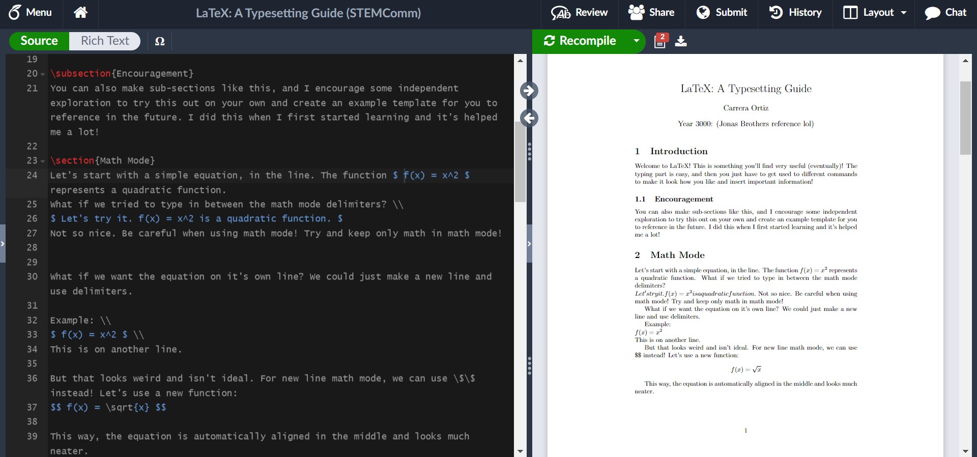
    Something else in math mode that is common, be it for a homework problem or simple discussion of the math, is using in-line math. This is where you don’t isolate the equation from the paragraphs, but simply keep it in-line with the words so that it’s all one neat paragraph. Let’s try it!

    This example shows the syntax for in-line math mode and newline math mode. For in-line math, the math is wrapped around single dollar signs on either side, such as how we had $ f(x) = x^2 $. The newline math, which is good for exemplifying results, work, or important equations that will be referenced later (something the equation environment makes easy), is wrapped around double dollar signs. In this example, we had $$ f(x) = \sqrt(x) $$.

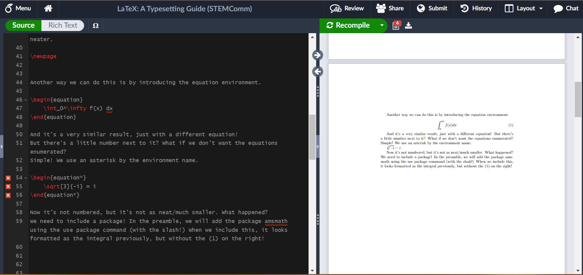
    I hinted that the equation environment is numbered (like you’d expect to see in a textbook), but you can opt-out of this! Let’s see what this is like in LaTeX.

    In this example, I showed us running into an issue where we needed a package. It’s not always easy to tell what the solution is to an issue, but here, google is your friend and luckily it isn’t too hard to find! I encourage you in your own example of trying out LaTeX to include the package and see what it looks like fixed!

    For some common math symbols or uses, like exponents or square roots, it may be easy to just let it become muscle memory to do it, but for more complicated commands like for summations or limits, you can create a table for yourself to reference. (Hint: There’s luckily also another option I shall share if you wait a couple more paragraphs!)

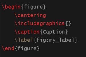
    Another thing you may want to include in your LaTeX abilities is including images, just as I have done in this article! It’s unfortunately not as intuitive as math mode, but Overleaf does a lot of the work for you still! Images are considered figures and are formatted through the figure environment. My general suggestion is in the file outline to create a folder for your images and upload them into there! To use the figure environment, you should insert a new package called graphicx into the preamble. By converting it to the figure environment, you’re given more control over where it is and the dimensions of your image, as well as some ability to caption and reference it. If you’re uninterested in the extra help, you can simply use “\includegraphics{yourImage}”.

    To use the figure environment, you can simply type \begin{figure} and press tab, then Overleaf should finish the basics of it for you. This should look like:

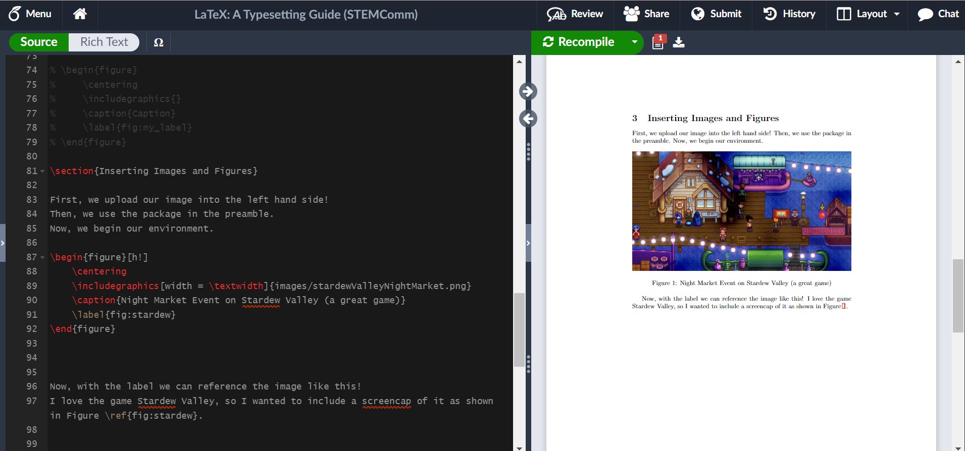
    Now, I will show you what it could look like with some editing in LaTeX!

    As you can see, I included some specific edits to control how I wanted the image to look. I controlled the width, what reference I used to make it easy for myself, and where it was in the article. If you want an image on a page of its own, you can use [p!] instead of [h!] next to the begin figure environment command. Additionally, there are ways to have grids or side-by-side pictures, so its something to play around with more!

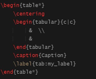
    Last instructions: Data Tables. Science is very reliant on data, so it makes sense that a lot of people interested in STEM might want to know how to include data tables in LaTeX. Expectedly, data tables have their own environment. The basics look like this:

    There are some recogizable things, like the centering command and the caption and label. These work just the same as the figure environment. The tabular environment within is noticably different. The columns of the table are controlled by the {c | c} arguments. If you would like more or less columns, you can alter the amount of c’s (but be sure to include the ‘|’ delimiters). The table is actually all written in the blank area with the ampersands and new line delimiters, which you may have recognized in my previous notes on syntax. Here, you may have something like:

    Column 1 Title & Column 2 Title \\

    data row 1 col 1 & data row 1 col 2 \\

    data row 2 cold 1 & data row 2 col 2

    to showcase your data. I would experiment with this on your own! For example, you can look at the Pokedex and list some Pokemon and their types/health/attack and more to try it out! It gets a little tiring, but eventually I’ll share some nice resources to make this easier as well!

    Now, with some nice writing and composition skills, plus the ability to insert some familiar math into LaTeX, I would like to introduce some resources that will change the life of anyone who has not already figured this out. These few resources will absolutely help anyone using LaTeX to “work smarter, not harder”.

    For example, there are plenty of different symbols and functions that I might need for a paper, and it’s not always as intuitive as writing out the name of the greek symbol after the escape key (but luckily sometimes it is). This is where Detexify comes into play! There are other similar resources for equations, but I have enjoyed this one the most. Detexify allows me to draw the symbol I would like to include in my document, and not only will it show me the command for the symbol, but it will also tell me what package it belongs to and what mode it is used in. For example, if I want to indicate “there exists a real number x” symbolically, I could spend some time googling each specific thing and then write it down and hopefully remember in the future. However, through Detexify I can draw the symbols I need and find out that the symbol for a real number uses the command “\mathds{R}” in math mode through the package dsfont. I find this quicker and more helpful than just knowing the relevant command to use, and a little better than referencing a table every time! You can find this website at https://detexify.kirelabs.org/classify.html.

    Additionally, data can become very length-y very quickly and make creating data tables excrutiating. Even some small tables can take a while to set up through LaTeX without a quick way to do it. However, there’s actually a convenient website where you can set up a table for any data you would like to show in a quick and easy manner (as you might in MS Word or another similar processor), then it produces the LaTeX code that corresponds with what you’ve entered. I only wish that I had found this when I was actually taking my Advanced Lab I course and didn’t spend an hour just filling in data I had written on paper into the document. You can find this website at https://www.tablesgenerator.com/.

    Also, there is indeed a LaTeX wiki for any other things you may want to look at (including a section that goes in more detail on images).

    The irony is not lost on me that this article sharing my LaTeX knowledge is not written in LaTeX. However, when I first learned to use it, I wrote everything out in my own personal article where I experimented with all of these things and more. It was also extremely useful for me to look back on in case there was anything I knew I had done before and just needed a quick reference on how I did it and what the result looked like. I strongly encourage everyone to practice in their own article and learn something new! Maybe, after reading this article, you’ll find you also want to share some fun tidbits of information in the neatest and best way possible: LaTeX!