One of the most popular displays today is an LCD display. They come in televisions, computer monitors, phones, and more, but do you know that chemistry and physics are the fundamental to create these screens?
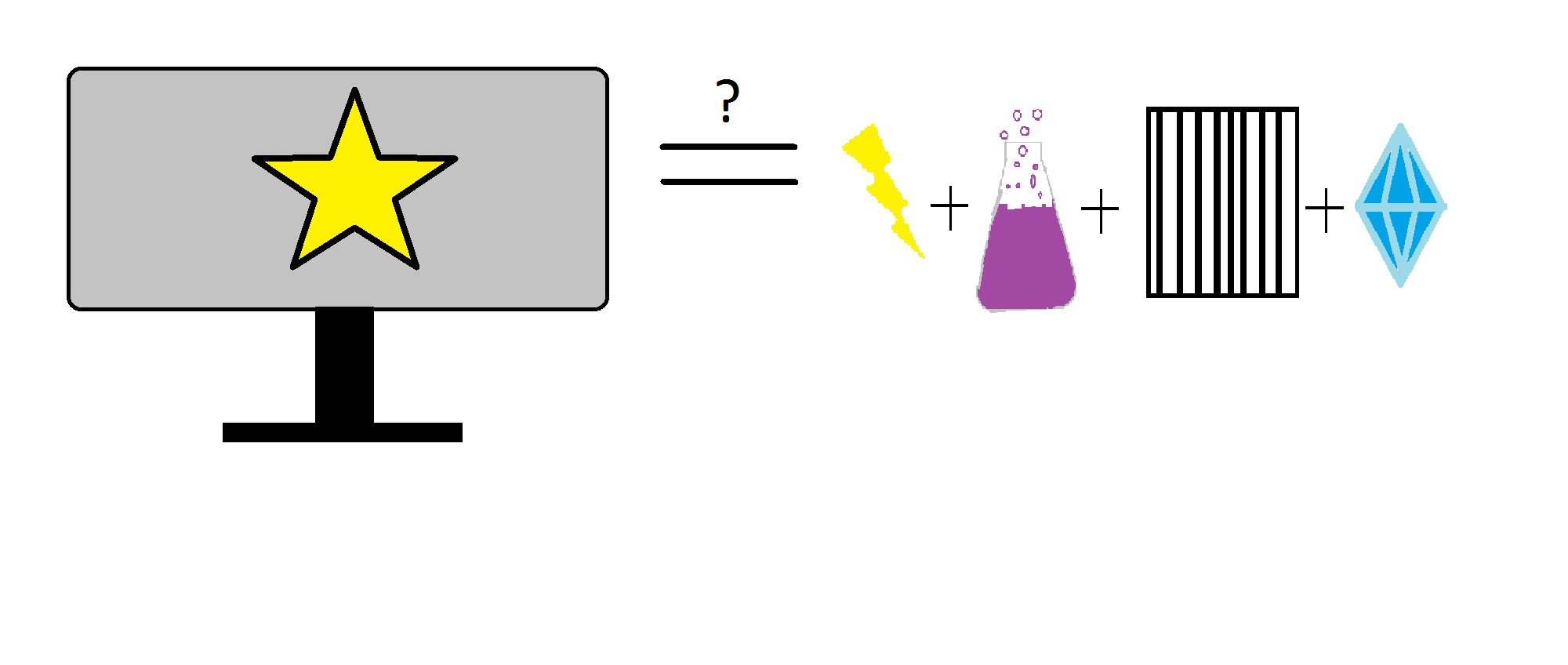
LCD stands for Liquid Crystal display and were used to replace Cathode Ray Tube displays because the CRTs were too bulky making televisions and computer monitors huge. Inside of an LCD display there are multiple layers: a thin filmed transistor, an electrode pattern, a liquid crystal and some level of polarization.
The thin filmed transistor is a very specific form of glass known as Borosilicate glass, made up of around 13% boron trioxide and around 80% silicon dioxide. Its physical properties due to its compound make up allows the glass to be more shock resistant and heat resistant than your average piece of glass. The electrode pattern uses metals like copper and titanium to transfer electrons. The polarizer mainly works with filtering light. Previously, light was just projected onto the television. Now a polarizer filters light waves by direction reducing the amount of power required to use a lit up display. It also allows for smooth picture transition. Finally the liquid crystal is used to produce the crisp look of an LCD screen. This crystal starts out as a liquid and when it comes into contact with the average atmospherics on the surface of the earth, this liquid crystallizes, like a spiders silk. It has the unique ability based on its shape and structure to show or not show various light rays. The polarizer prepares the light for this liquid crystal making its job possible.
So there you have it, now you know whats behind that magic box in your living room!
I am sitting. More specifically, I am waiting. Waiting on the box in front of me, a box that reminds me of my grandmother’s post-war era microwave on account of its single all-purpose knob, with the only exception being the spaghetti tubing running out of the top in two directions. The box is not an outdated kitchen appliance but a vacuum drying oven. The lollipop shaped vacuum gauge marches counter-clockwise until…
Well, until nothing. The danged thing has stalled just before bottoming out on the little steel peg that says “stick a fork in me, I’m done.”
I rouse myself to check my watch. It’s late. I haven’t seen another person save the blue handed, white cloak laden wardens of the halls for some time. The graduate students, we chosen few, patrol the length of linoleum from office to lab. I shimmy my own blue nitrile gloves down a little further and pull up the stained cuff of my lab coat to see if I have mistaken the watch face. I haven’t.
Leaning forward and squinting, I can see the small vial inside of my grandmother’s “cooker” containing a slurry of manganese dioxide and water has begun to fizzle as its boiling temperature is shifted downward. Water molecules consider their life up to this point and decide things are looking better in the great beyond, say goodbye to their friends and family, sever what remaining bonds they have to the liquid state and float into the void of the vacuum. Things are so bad in the vial, it seems, that enough of the little buggers are escaping to keep the pressure in the box from bottoming out. An imaginary leak produced from within: the bane of vacuum experimenters everywhere. I think of the Armstrong limit and making macaroni and cheese on Mount Everest. Using my phone and the cleanest edge of my glove I search the web aimlessly. The Wikipedia page says manganese dioxide was historically used as a pigment. I am literally watching paint dry.
Bored with the experiment, I decide to promote the box into the 21st century. As Ron Popeil would say, “set it and forget it”. Forgotten! After a final scrutinizing glance at the little vial, I decide to take an evening stroll around the long abandoned corridors. When I open the door to my lab, air whooshes in from the hall. Another fine example of a mechanically induced pressure gradient, but instead of the little rotary vane pump that is busily gobbling down water molecules from the vacuum oven with its occasional old-man-clearing-his-throat grumbles and burping them into the lab, this one is caused by the fume hood in the back corner of the room. The influx causes my unbuttoned lab coat to unfurl behind me like a cape.
A good lab coat imbues the wearer with a certain Fonzerellian swagger. The pop-able collar, the carefully placed stains, the pocket full of scoops and tweezers and balled up kim-wipes and what not. It’s all a carefully orchestrated ensemble. I toss my nitriles into the waste bin and move my safety-glasses to the Doc Brown position. Normally I’d put on a Ratatat album and Gene Kelley up and down the halls, but on this eve I stumble upon the Danger Zone.
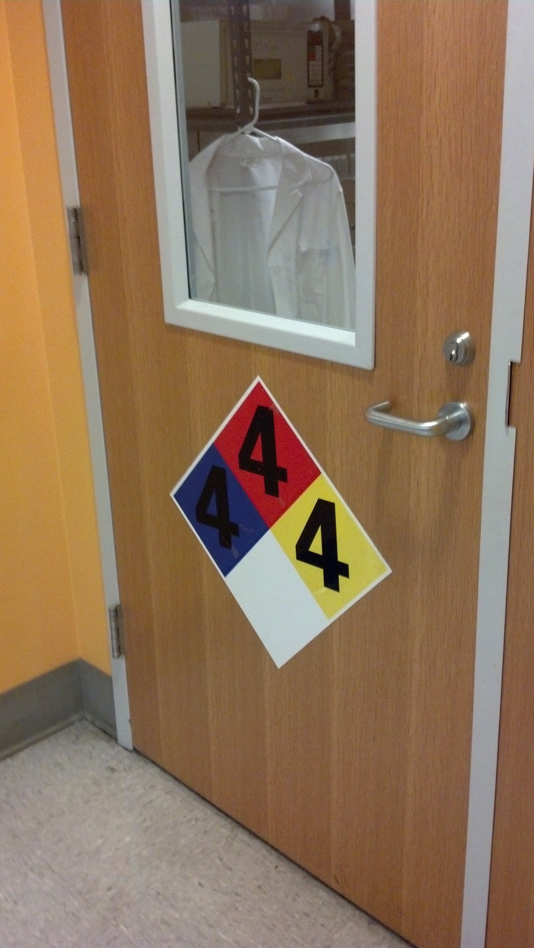
The Gateway to the Danger Zone
The Danger Zone is indicated by a large, multicolored diamond placard hung on the door of a neighboring lab. This diamond is subdivided into four sub-diamonds – one blue, one red, one yellow and one white. In the top three colored diamonds there stands an ominous number four. I can tell it is ominous because of the deliberate choice to use a bold-faced font. Italics is subtle, bold-face is ominous. Common knowledge. The placard is an NFPA safety diamond with the highest simultaneous ratings I’ve ever seen. The NFPA diamond is the universal indicator for scientists, engineers and common folk alike to tell you the likelihood of imminent liquidation of internal organs. You’ve probably seen one on the sides of chemical trucks on the highway or in your uncle Ned’s doomsday bunker. I’ve been to enough Environmental Health and Safety seminars to know that pretty much only a nuclear holocaust gets a 4 in every category of the NFPA diamond, those categories being health, flammability and reactivity. For comparison, gasoline, which makes such suburban pastimes as the fire melon possible, gets a three for flammability. Yeah. Meanwhile, “very short” exposure to a number 4 health hazard can be fatal and a number 4 reactivity rating is explosive at room temperature with minimal agitation.
I have to admit, even swaddled as I am in my lab coat, I begin feeling a little overwhelmed by the idea that a mere 15 feet away from my vial of manganese dioxide (which gets a paltry rating of 1 for health and flammability and 2 for reactivity) are three distinct ways to get sent to the hospital. How do I know there are three? Well, to speak truthfully I don’t, but I would place a wager that no single chemical exists with NFPA ratings of all 4’s that would be allowed within 40 miles of a population center like metro Atlanta. Furthermore, general NFPA labeling like the one on the door to the danger zone indicates the highest combined hazards of all the chemicals found within. I imagine at least two chemicals were needed to propel a lab into the danger zone category. A container of hydrofluoric acid (which will dissolve your bones through your skin) and tri-nitro-tolune (it’s TNT, it’s dynamite) would give you a combined rating of all 4’s.
I retreat to the relative safety of my lab and barricade the door.
OK, kids, we need to talk. No, you’re not in trouble. The people in trouble are health, anatomy, and psychology teachers who try to teach a specific concept that is WRONG.
Any guesses about what connects those teachers? No? Well, here’s the offending diagram.
Don’t believe images like this. EVER.
That, my lovelies, is a picture of a tongue. But see those cool segments that tell you what flavor is tasted by each segment of the tongue? They’re completely and totally unnecessary. Your tongue doesn’t work that way, despite what so many teachers and even college professors would have you believe.
No, don’t try to look all cute and happy, Mr. Boring. You’re on scientific trial here.
Let’s go back a bit to Harvard University circa 1901. A psychologist, Edwin G. Boring (more like Edwin G. Mistaken-Fact-Check) misinterprets data in a German paper, leading to the belief that each region of the tongue is specialized to taste exactly one of four basic flavors.
“OH! Cool!” he says, thinking this break-through will change the way we interact with food (or something).
Trust me, it didn’t.
Let’s fast forward to 1974, when Virginia Collins discovered that all tastes are distributed equally across the tongue. Case closed, right?
NOPE! People are STILL using the tongue map to explain taste buds in 2012!
Let’s expand your knowledge a bit, though. Why is this tongue map concept so incredibly insulting to the science of taste? Here’s three big reasons why!
Well, first off, it is incorrect in the count of basic flavors. The map shows the four flavors (bitter, sour, salty, and sweet) that were known in 1901, but there are at least five that we know of now. The four that are on the map DO exist; the fifth wheel of taste we use at a wine and cheese party is actually one of the most important – umami. That’s the taste of savory things like meat and cheese, and was described as early as 1908, a mere seven years after Boring made his translational mistake.
Secondly, the map claims the receptors for each flavor only exist on the edges of the tongue, the very back, and the very tip. That leaves a HUGE bit of space that doesn’t really do much, right smack in the center… where most food hits the tongue.
Um. Science says, “Whoops?”
It’s an impractical model from the start, is what I’m trying to say.
Thirdly, our sense of taste is much more important in basic development and exploration than the map allows for. From the time we are born, we explore the world through all of our senses. Senses like sight don’t fully develop until we are between 6 and 18 months of age, but we make up for what we lack by using other senses, taste, in the case of infants.
Well, why is that particularly important, you ask? Because of chemistry. The basic correlation between chemistry and taste is that acids taste sour and bases taste bitter. The safest way of testing this is to taste a lemon, which is full of citric acid. It’s sour, right? Right.
Since things that are bitter are not necessarily desirable as food products, it’s very difficult to find them on market shelves. Egg whites and some crackers are the closest edible things you’ll find to basic foods.
Now, think back to childhood…. Do you think a baby would like something that tastes bitter? NO! That’s a natural response. It’s a safety precaution, too; bitter foods tend to contain deadly chemicals, like ammonia. According to the tongue map, those substances would have to hit the back of the tongue to be tasted, which probably means someone is going to have to call poison control because little Johnny has swallowed ammonia instead of spitting it back out because he tasted that bitterness immediately.
So, lesson of the day? Don’t think of the tongue as some city planner’s way of keeping the taste bud gangs from having turf wars. It’s much more accurate to think of it as a metro area, where everybody mixes and coexists while doing their jobs.

.jpg)